Introduction to Bar Graph
This document introduces Bar Graph in OnPing and briefly describes how to create one.
What is Bar Graph?
Generally speaking, bar graphs are graphical representations of data using horizontal or vertical bars. The height (or width) of the bars is proportional to the data value they represent.
In OnPing, these graphs are managed through the Bar Graph widget. OnPing’s Bar Graph widget supports the full range of standard bar graph orientations: horizontal, vertical, grouped, and stacked.
Creating a Bar Graph
First, add a Bar Graph widget.
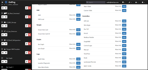
After adding the graph, add a label then save the dashboard. The newly created graph will be displayed on the panel with the new name.
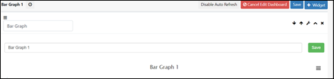
Adding Metric to Bar Graph
Now that we have a graph, it’s time to add stuff to it!
To add information to the graph, first open the widget editing window, then scroll down to the settings area, shown below:
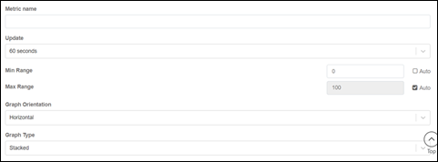
Enter the “Metric” name. It is used to compare metric values across different groups of data points. Other values to be set up include the update frequency, minimum range value, maximum range value, graph orientation (horizontal or vertical), and graph type (Stacked or Individual).
You can scroll down further to the Groups and Parameters setting area as shown below
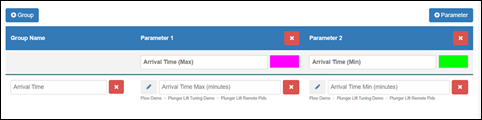
You can create multiple groups of graphs, each with multiple bars. Each bar will be connected to a parameter as data source, by clicking on the Parameter button and selecting a parameter as shown below:
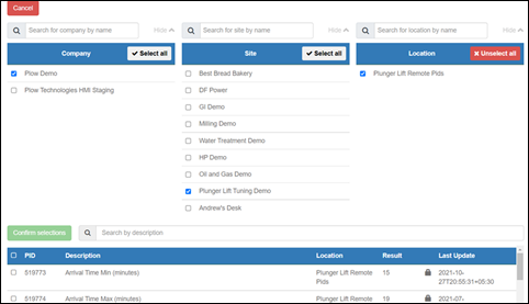
Once you have attached a parameter to each bar and selected its color, you can scroll back up and click on the Save button to save the graph.
Now you can view the graph at the top of the display area:
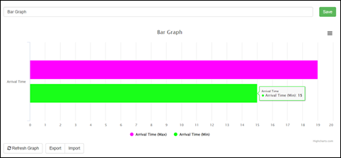
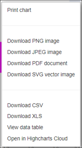
You can click on the hamburger menu at the top-right corner of the graph to access a menu to print or export the graph.
Summary
The Bar Graph feature on OnPing provides a visual representation of categorical values of the process for analysis and comparison. By using multiple groups, you can view comparative values in a graphical format to support decision-making on process management and enhancement.
Was this article helpful?
That’s Great!
Thank you for your feedback
Sorry! We couldn't be helpful
Thank you for your feedback
Feedback sent
We appreciate your effort and will try to fix the article