Introduction
A line graph is a graphical representation of information that changes over time. It charts data by connecting reference points with line segments.
Line graphs are a powerful way to quickly analyze and summarize information to predict and regulate the processes.
Getting Started
A line graph can be created for any defined parameters by adding the Line Graph widget to a panel. In OnPing, line graphs are an excellent way to represent data trends over time.
To begin, add a Line Graph widget to the desired panel. If you need a refresher on adding widgets to panels, check out our OnPing widgets overview.
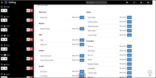
Line Graph Settings
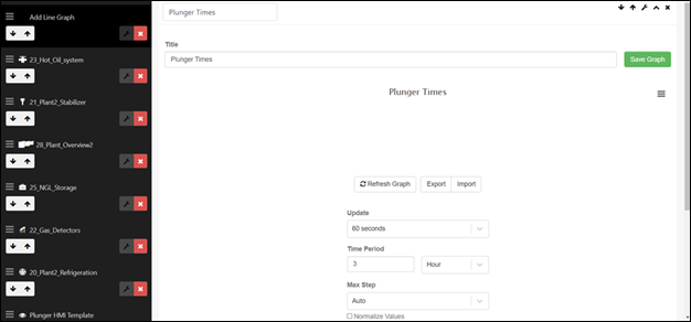
Select to enter the widget name, graph title, Update, and Max Step fields.
The update is a dropdown field with 60 seconds and Real-Time as options. Real-Time should be selected when the graph needs to present a graphical representation in real time.
Add Parameters
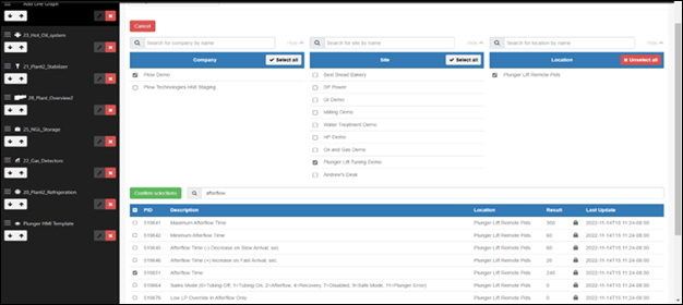
Scroll down to add parameters to the Y-Axis by clicking the Add parameter button. This will open a new screen that lets you add any existing parameter to the graph.
You can use the search field to search for any parameter.
Confirm and Save
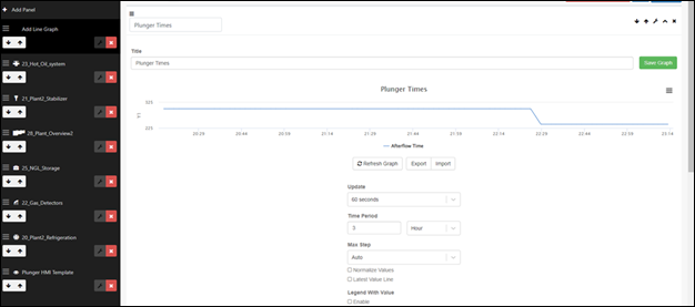
Once the parameters have been selected, click the ‘Confirm selections’ button to view the Line graph for the selected parameter. If you like what you see, go ahead and save the changes to the dashboard.
Changing Time Frame and Data Visibility
OnPing provides a lot of flexibility in how Users can access and utilize data. Line graph is no different! You can change the Time period in the graph to view the trend over a longer duration. You can also select to view trends for a minute, hour, day, week, or month.
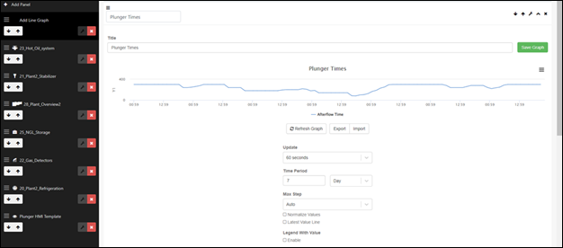
Basic Elements
Y-Axis Selector
Each line graph should include at least one data parameter that is represented in the graph and can be analyzed by validating how its value changes over time. These data parameters could be any process parameter, e.g., Afterflow time.
The parameter is required to be selected in Y-Axis Selector when creating or editing a line graph widget, as shown below.
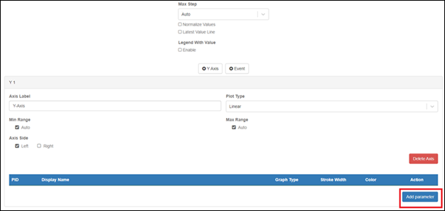
Fields
- Update
- This is a dropdown field with valid values as 60 seconds or Real-time
- ‘Real-time’ can be selected if you want the graph to update upon receiving new data
- Selecting 60 seconds will include a lag of 60 seconds.
- Time Period
- This identifies the time period of the graph in a unit of measure of time (hours, days, weeks, or months)
- Max step
- This sets the stepping of the data points
- You can also check “Legend with Values” to activate the functionality.
Time Travel Mode
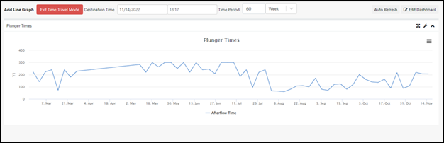
Line Graphs are compatible with Time Travel Mode! Time Travel allows you to quickly change the perspective of a line graph to a period of time covered by previously existing data. This mode is very helpful when you want to see the trend over a period of time.
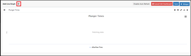
Time travel mode can be enabled by clicking the clock icon next to the widget name, as highlighted below.
You can change the destination time and time period to view the trend over a different time period.
Conclusion
The Line Graph functionality provides a visual representation of process values over time. You can also create multiple graphs on one page and stack them for comparative purposes.
Was this article helpful?
That’s Great!
Thank you for your feedback
Sorry! We couldn't be helpful
Thank you for your feedback
Feedback sent
We appreciate your effort and will try to fix the article